
Published: November 2025 | Last updated: May 2026 | Editorial review and quality control: Martina N.
Look at any chart showing rising STD numbers and the first instinct is panic. The bars climb. Headlines warn of crisis. Your state map lights up red. Before those visuals decide how you feel about your own risk, it helps to know what those numbers actually count, and what they leave out.
Rising case counts are real. For most of the past decade, the CDC's annual STI Surveillance Report showed chlamydia, gonorrhea, and syphilis climbing toward historically high levels. The 2024 provisional data marked the third consecutive year of overall decline, a meaningful shift, but the decade of rising numbers still shapes how most headlines frame STI risk today. A statistic only includes people who tested and whose results made it into the public health system. Self-diagnosed cases treated quietly, uninsured patients who waited too long, undocumented individuals avoiding clinics, and entire populations with limited testing access never enter the data. "Rising STD rates" can mean more infections, more testing, better reporting, or all three at once, and "falling STD rates" carries the same ambiguity.
For someone scanning the data for the first time, the phrase is also doing more conceptual work than it can carry. The same line on a chart covers true outbreaks, like the persistent rise in adult and congenital syphilis the CDC flagged repeatedly through the early 2020s, and the testing-driven case-count shifts that follow improvements (or collapses) in screening access. Both move the same line. Only one of them is a public health emergency in the way the headline implies.
This guide reads those numbers with you. You will get the context the headlines skip, a sense of where the data is most trustworthy and where it is full of gaps, and a clear answer to the question most readers actually arrive with: does any of this matter for me personally, today?
Key Takeaways
- Reported STD case counts reflect both real infections and how much testing is happening, so a rising number can mean better detection rather than more spread, and a falling number can mean fewer screenings rather than fewer infections.
- The strongest personal response to a scary headline is a routine test. Knowing your own status and treating any infection early changes the data and protects partners.
Why the Numbers Look Higher Than They Should
Reported cases of chlamydia, gonorrhea, and syphilis climbed steadily through most of the 2010s and peaked around 2021-2022. According to the CDC annual STI Surveillance Report, primary and secondary syphilis cases more than doubled between 2015 and 2022, and gonorrhea grew by roughly 80 percent over the same span. Those are real increases. They are also numbers shaped by everything that happens between someone being exposed and a case landing in a federal report.
The decade that produced those climbing curves was also a decade of expanded screening. Routine chlamydia and gonorrhea testing was added to many primary care visits. Universities, LGBTQ+ clinics, prenatal programs, and rural telehealth services rolled out targeted testing campaigns. Self-collected swabs and at-home rapid kits cut the friction for people who would have skipped a clinic. The result is exactly what a working public health system should produce, infections that were already there finally getting counted and treated.
That overlap matters. When more people test, more cases get diagnosed. When more cases get diagnosed, more end up in surveillance data. A line going up on a chart can mean the disease is spreading faster, the testing net got wider, or both at the same time. The 2024 provisional data shows a third consecutive year of overall decline, but whether that reflects genuinely falling transmission or partial pandemic-era screening collapse that has not fully rebounded is still being unpacked by epidemiologists. Without knowing testing volume in the same period, the line on its own is incomplete information.
Surveillance counts are a working tool for public health agencies. They use the data to decide where to send funding, which populations need outreach, and which assays to recommend. The counts are not a personal risk score. Your individual chance of being exposed depends on your network of partners, your protection habits, and the testing history of the people you sleep with, not on a state-wide rate per 100,000.
The table below shows the three infections most often quoted in scary headlines through the climb and the early signs of reversal. All three rose, then turned downward, but at different rates and with different drivers behind them.
| Year | Chlamydia (Reported Cases) | Gonorrhea (Reported Cases) | Syphilis, Primary & Secondary |
|---|---|---|---|
| 2015 | 1,526,658 | 395,216 | 23,872 |
| 2018 | 1,758,668 | 583,405 | 35,063 |
| 2022 | 1,644,416 | 710,151 | 54,671 |
| 2024 (provisional) | 1,515,985 | approximately 543,000 | approximately 46,000 |
Do rising STD case counts mean infections are surging?
Not always. A reported case count rises whenever true infections rise, whenever testing expands, or both at once, and the same logic applies in reverse to falling counts. Most decade-long climbs in CDC chlamydia and gonorrhea data through the 2010s were driven by both factors together, with screening expansion accounting for a meaningful share. Syphilis was the standout exception, where most of the rise reflected genuine increased transmission, including a persistent rise in congenital cases. The 2024 provisional data shows the third consecutive year of overall decline, which is a real signal worth following but does not, on its own, mean the underlying epidemic is solved.
What Counts, and What Doesn't, in the Data
A surveillance report is a census of cases that successfully made it through a multi-step pipeline. The person had to be exposed, develop the infection, decide to test, actually test, return for results, get a positive, and have that positive forwarded to a state or federal database. Drop out at any stage and the case never exists in the statistic. The dropout rate at each stage is substantial.
Picture someone who uses an at-home swab kit, sees a positive line, and books a telehealth appointment for treatment. The infection got treated, which is the outcome that matters clinically. The result, in most cases, never reaches the CDC. Self-collected, self-reported positives are not in the federal pipeline. The patient is healthier, the partner got told, and the statistic remains unchanged.
Now picture someone with limited insurance who has chlamydia but no symptoms, never tests, and clears it on their own months later. Chlamydia can self-resolve in some adults without treatment, though damage to reproductive tissue can still occur silently. That case never existed for public health data, but it absolutely existed in the body.
This is why subgroup comparisons in STI data deserve a careful read. If young Black women in the South show higher reported rates of gonorrhea, the explanation may be that targeted screening reaches them more reliably than wealthier white populations with comparable risk who simply do not test. The infection rate could be higher, lower, or equal across groups. The data shows where care is reaching effectively rather than where infection sits at its highest.
None of this is reason to dismiss the data. It is reason to read it for what it is, an imperfect map of where the public health system is working and where it is blind.
The Myth of "Most Infected" States
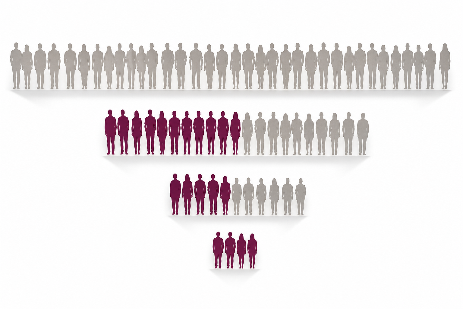
Annual rankings give every state a single number, infections per 100,000 residents, and turn the result into a leaderboard. Louisiana, Mississippi, and Alaska tend to top the chlamydia and gonorrhea charts year after year. The leaderboard is real. The explanation behind it is rarely what the headline implies.
States with strong public health funding, active mobile clinics, prenatal screening programs, and university health systems test more people. More testing produces more diagnoses. More diagnoses raise the per-capita rate. The same state, with the same actual infection burden, can shift up or down the leaderboard year over year based on how a single screening grant lands. A "high STD" ranking can be a signal of working infrastructure rather than collapsed prevention.
The flip side is just as important. Some rural and under-resourced states report lower rates not because infection is lower but because testing access is thin. Thin access compounds the problem in concrete ways: fewer clinics, longer drives to a screening site, less insurance coverage, and heavier stigma all reduce the odds that someone with an infection ever gets diagnosed. A "safe" state on the map can be a state where the data is mostly missing.
So when a state ranking gets shared, the most useful question is whether that state is finding and treating infections better than its neighbors, rather than whether people there are more reckless.
The table below pairs reported chlamydia rates with a rough proxy for testing access. The chlamydia rates come from CDC 2022 surveillance data. The Testing Access Score is an editorial proxy built from public-health-infrastructure indicators (free testing centers per capita, mobile-unit coverage, school-based screening programs), not a published CDC or state-health-department metric, so use it as a directional cue rather than a precise number. The pattern is messy on purpose, because the relationship between rates and risk is messy in reality.
| State | Chlamydia Rate (per 100,000) | Testing Access Score |
|---|---|---|
| Louisiana | 719.8 | High |
| New Hampshire | 209.3 | Low |
| California | 506.5 | Moderate |
False Spikes and the "Testing Boom" Effect
Some of the sharpest year-over-year increases in STI counts have nothing to do with bedroom behavior. They follow a policy change. After a statewide initiative offering free chlamydia screening to all college students, reported cases in some counties have roughly doubled within a year. Media coverage often calls it a crisis. What public health workers see is a backlog of silent infections finally getting found.
This is the testing boom effect. Turn on more screening capacity in a population that has been undertested, and the case count goes up immediately. The mess was always there. Better lighting did not create it. The same effect runs in reverse. During the first year of the COVID-19 pandemic, routine STI screening dropped sharply in many states. Reported cases dipped in some categories. The dip was not a transmission decline, it was a service collapse. People with active infections were not getting diagnosed, and many sat untreated until clinics reopened.
This is why year-over-year comparisons that ignore testing volume are misleading. A reported decline can mean fewer infections, or it can mean fewer screenings. A reported spike can mean a real outbreak, or it can mean a successful outreach campaign. Reading the trend honestly means asking, in the same breath, what happened to the denominator. How many tests were performed? Where? With whose budget?
Positivity rate is a more honest signal than raw case counts. It measures the share of tests performed that came back positive, which controls for changes in testing volume. A rising positivity rate in a population where testing has stayed constant is a more reliable indicator of true transmission than a rising case count alone. Public health agencies do publish positivity-rate trends, though headlines rarely lead with them because they require more explanation.
The most accurate signal that something is genuinely changing in transmission comes from looking at multiple indicators together. Positivity rates, demographic shifts, new outbreak clusters identified through contact tracing, and antibiotic-resistance patterns all add context. A single rising line on a chart, on its own, is the weakest possible evidence of a crisis.
Positivity rate is the share of tests performed that come back positive. Unlike raw case counts, it does not balloon just because more people walked into a clinic, and it does not collapse just because clinics were closed during a service disruption. When transmission is genuinely rising, positivity rises alongside the case count. When testing alone is rising, positivity stays flat or falls. Public health agencies publish these trends; headlines rarely do.
Where the Silence Lives: Underreporting and Exclusion
Surveillance gaps are not random. They cluster in specific populations that the public health system has historically struggled to reach. Undocumented residents often avoid public clinics because of immigration concerns. Queer youth on family insurance plans may not test for fear of explanation-of-benefits letters being sent home. Sex workers may rely on informal testing networks that do not report into state databases. People who are incarcerated have notoriously inconsistent screening, even though correctional STI rates are well-documented as elevated.
The result is that some of the highest-risk groups for transmission are also the most invisible in the dataset. Pull up the surveillance map and the picture you get is partly real and partly an artifact of who shows up where care exists.
This matters when conclusions like "Black gay men in urban centers are most at risk" enter public conversation. The phrasing is not wrong, but it deserves a comparison group, and the comparison group is often missing. Most at risk compared to who? Compared to rural straight men who almost never test? Compared to wealthy clients of private concierge clinics whose results never enter the public surveillance pipeline at all? The honest answer is that we do not always know. The data we have is the data the system collects, and the system collects unevenly.
The pipeline for surveillance data also depends on lab reporting standards that vary by state. Some states require all STI lab results to flow to the state health department within days. Others have weaker mandates. The federal CDC database aggregates whatever the states send up, which means the same infection in two different states can have different odds of being counted. Year-over-year comparisons between states deserve that asterisk.
Closing those gaps takes investment in the parts of the pipeline that are weakest, especially in the populations and regions that are currently invisible to the data.
Treat a red zone as a signal that screening is working, not as a signal that the people there are reckless. Treat a green zone with caution, especially if the state has limited public health funding. Use the map to decide where outreach should go, not who to judge.
How to Actually Use STI Statistics
Once you stop reading surveillance data as a personal risk score, it becomes useful for the work it was actually built to do. Public health departments use trend lines to decide where to send mobile testing units, which counties need a new federally qualified health center, which assays to subsidize, and which populations need a tailored prevention campaign. These are funding decisions, not personal ones.
For an individual reader, the more practical questions are local and concrete. Where in your area is free or low-cost testing available? Does your insurance cover routine STI screening as preventive care, which most plans do under the Affordable Care Act for several common infections? When did you last test, and was it within an appropriate window for any exposures since? These questions are what move your personal risk needle.
National statistics have one indirect use for individuals, which is in scheduling. If a partner mentions higher prevalence of a specific infection in their community, that is a reasonable nudge to add that infection to your next screening panel. If your area has a confirmed local outbreak, retesting on the early side makes sense. Outside those triggers, what protects you is consistent screening, honest partner conversations, and prompt treatment of anything positive.
Two practical questions worth bringing to every screening cycle are: was I exposed to anything since my last test, and is my current panel comprehensive enough for that exposure profile. The default panel at a standard clinic visit may not cover everything. Trichomoniasis and herpes are often added only on request. Hepatitis C screening is routine for adults but is sometimes skipped if the visit reason is narrowly defined. Asking explicitly which infections are in the test you are being given is reasonable, and it is the kind of conversation that closes gaps surveillance data is built to track.
Reported case counts reflect both the true burden of disease and the intensity of screening, testing, and reporting efforts. Rising case counts may indicate increased transmission, expanded screening, or both.
A quick disclosure: this article is published by stdrapidtestkits.com, which sells at-home STI testing kits. The recommendation below reflects that, and we only recommend products that fit the reader's concern, not based on commercial benefit.
Your Power Is in the Follow-Up
A single test result is a snapshot of one moment in your sexual history. It cannot tell you about exposures that happened inside the test's window period. It cannot tell you about partners you will meet next month. What it can tell you is what is true today, with the information available. For most people, that is enough to plan the next step.
A reasonable rhythm for most sexually active adults is screening every 3 to 6 months if you have new or multiple partners, immediately after any known exposure once you are past the relevant window period, and as part of any new sexual relationship as a shared baseline. The CDC publishes separate clinical screening guidance for higher-frequency testing in pregnant patients and men who have sex with men; a primary care provider can point you to those specific recommendations. The full surveillance numbers behind the broader trends are available in the CDC annual STI Surveillance Report.
If a result comes back positive, the practical next steps matter more than the emotional weight of the moment. Most bacterial STIs (chlamydia, gonorrhea, syphilis, trichomoniasis) are curable with a single course of antibiotics. Viral infections like HSV-2 and HIV are not curable but are highly manageable. Modern HIV treatment is so effective that a person on consistent antiretroviral medication (the drugs that suppress HIV replication) carries no detectable viral load and cannot transmit the virus sexually, a finding the CDC describes as scientifically settled. Treatment also prevents the long-term complications that drive most of the real harm from these infections.
Every infection that gets treated is one that does not pass on to a future partner. That is the small, repeatable choice that shifts the next surveillance report in a direction the headlines never feature.
A practical testing cadence
- Every 3-6 months if you have new or multiple partners.
- After any known exposure, once you are past the relevant window period for the infection in question.
- At the start of each new sexual relationship as a shared baseline with your partner.
- More frequent testing recommended by the CDC for pregnant patients, men who have sex with men, and anyone with a recent known exposure.
It's Not About the Numbers, It's About Your Next Test
A bar chart of rising case counts cannot tell you whether you have an infection right now. A heat map cannot replace a 15-minute swab. A scary headline cannot substitute for a conversation with a partner about testing history. Surveillance data was built to guide public health policy, and it does that work imperfectly but seriously. It was never built to tell any individual reader what to feel.
What it can do, used well, is give you permission to take screening seriously without panic. STIs are common, most are curable, and all are treatable. The cost of finding one early is a single test and a course of medication. The cost of not finding one can be infertility, chronic pain, neurological complications, or onward transmission to people who trusted you with their health.
If you are in a "hot zone" on a state map and feeling overwhelmed, here is what that signal usually means in practice. The public health system is paying attention where you live, which is one of the better things a region can have. Building screening into your routine the way you would dental cleanings keeps you ahead of whatever the next report says.
So the next time a chart climbs and a headline shouts, consider that the same data point can be evidence of crisis or evidence of competence, depending on what is moving underneath it. Then consider what is moving underneath your own choices. If it has been a while since your last test, scheduling one this week is a reasonable next step.
The cost calculus of early detection
- Early detection cost: one rapid test and, for most bacterial infections, a single course of antibiotics.
- Untreated infection cost: infertility, chronic pelvic pain, neurological complications, congenital transmission in pregnancy, or onward transmission to partners who trusted you with their health.
Frequently Asked Questions
- Why are STD case counts always rising in the headlines?
- Reported cases climbed steadily through most of the 2010s because more people got tested and diagnosed than ever before. Some of that increase reflected real transmission, especially for syphilis. A meaningful share was delayed detection finally catching up. The 2024 provisional data marked a third consecutive year of overall decline, which is a real signal worth following, but a rising or falling line on a chart by itself does not tell you whether a disease is spreading faster or whether the testing net got wider.
- Does living in a "high STD" state mean my personal risk is higher?
- Not directly. State rankings are driven by testing capacity as much as by transmission. A high-ranked state often has stronger public health infrastructure that finds infections others miss. Your personal risk depends on your network, your protection habits, and your testing history, not your zip code.
- Are these statistics telling the whole truth?
- They are telling a partial truth. At-home tests, uninsured patients who never test, undocumented residents who avoid clinics, and asymptomatic infections that self-resolve all sit outside the data. The real prevalence is almost certainly higher than the reports show, but the gap is also distributed unevenly across populations.
- Why do some groups appear overrepresented in surveillance data?
- Often because public health programs reach those groups for screening more reliably than others. Black women, queer men, and low-income populations are frequently the focus of targeted prevention campaigns, which improves their detection rates relative to wealthier groups with comparable risk who simply do not test as often.
- How should I read a state-level STD heat map?
- Pay attention to the time lag first. State maps usually reflect cases reported 12 to 24 months ago, which means a screening campaign launched last summer might not show up as a rate change until the next report cycle. Then check the state's surveillance methodology notes, often linked in a footer or appendix, to see whether the state reports all positive lab results within a few days or has weaker mandates. If a state has thorough reporting and active outreach, a red color often signals that the system is finding infections rather than that residents are at higher transmission risk.
- Can I still have an STD if my partner just tested negative?
- Yes, especially in the first few weeks after a possible exposure. Many infections have window periods, the gap between getting infected and the test being able to detect it, that range from days to weeks. A negative test from your partner today does not rule out an infection acquired since the test, or one acquired too recently to register. Retest at the appropriate window if you are uncertain.
- How often should I get tested if I feel fine?
- For sexually active adults with new or multiple partners, every 3 to 6 months is a reasonable cadence. The CDC recommends more frequent testing for some groups, including pregnant patients, sexually active men who have sex with men, and anyone with a known exposure. Most early-stage STIs are silent, so feeling fine is not evidence of being clear.
- What is the simplest way to test if I want to skip the clinic?
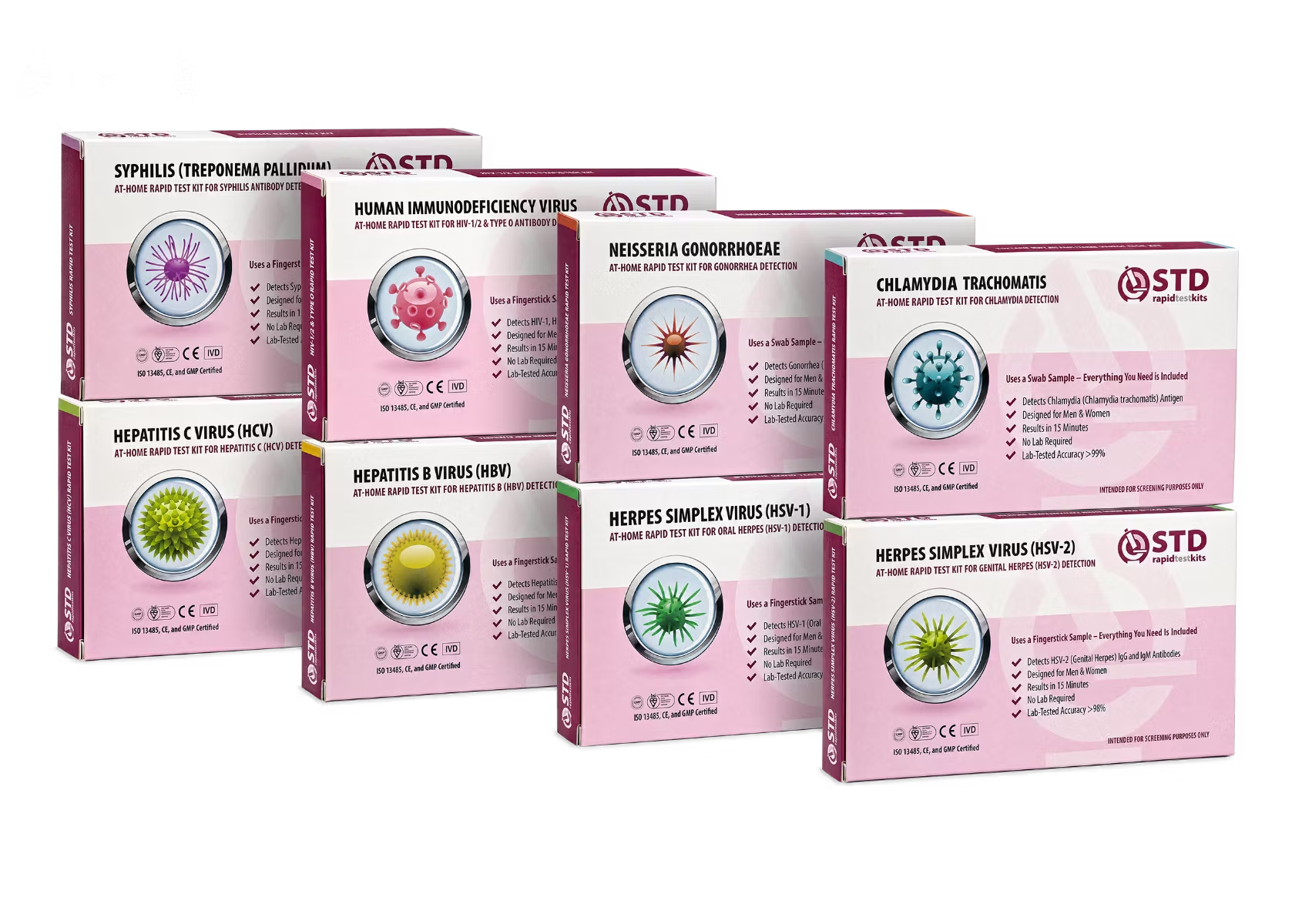
- An at-home rapid test kit covers most of the common infections, gives a result in about 15 minutes, and ships discreetly. It is a reasonable first screen, especially if a clinic visit is hard to schedule. Anything positive at home is worth following up with a clinic to confirm and start treatment.
This article draws on current CDC and WHO surveillance methodology, the CDC's modeled prevalence-and-incidence estimates that sit alongside its reported case counts, the 2024 provisional STI Surveillance Report figures, and standard public health interpretation of testing-volume effects on case data. It is written for a general adult reader and is not a substitute for personal medical advice from a licensed clinician.
- U.S. Centers for Disease Control and Prevention. Annual Sexually Transmitted Infections Surveillance Report, including the 2024 provisional data showing the third consecutive year of overall decline.
- U.S. Centers for Disease Control and Prevention. STI Statistics overview, the navigational hub for surveillance reports and historical data archives.
- U.S. Centers for Disease Control and Prevention. NCHHSTP director letter releasing the most recent national STI data and contextualizing recent trends.
- World Health Organization. Sexually Transmitted Infections fact sheet, including global incidence estimates and detection challenges.
- U.S. Centers for Disease Control and Prevention. Sexually Transmitted Diseases FastStats summary of common infections and surveillance counts.
- U.S. Centers for Disease Control and Prevention. Prevalence, Incidence, and Cost Estimates for Sexually Transmitted Infections, the modeled estimates that bridge surveillance case counts and true population prevalence.